Infinity Group
Client: Infinity Group
Industry: Travel & Tourism
Sub-Brands: Infinity Cruises, Infinity Sports Travel, Infinity Tours
Rebranding Project
Infinity Group, a leading UK travel company with sub-brands including Infinity Cruises, Sports Travel, and Tours, sought a comprehensive rebranding to better reflect their high-level service and unify their brand identity after significant growth. This project focused on creating a visually strong brand that incorporated their core value of "Drive" and the universal infinity symbol.
How:
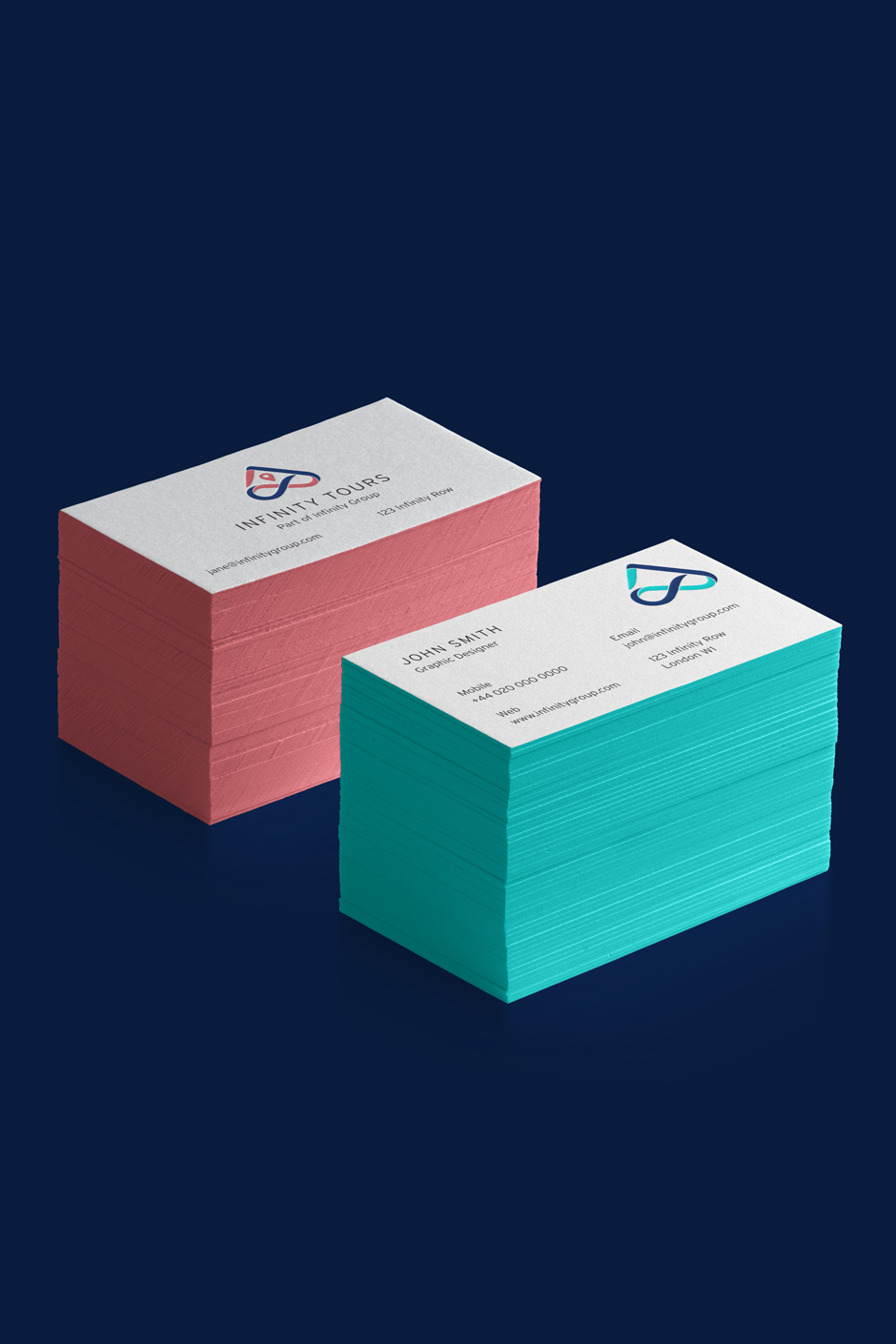
- Logo Design: Developed a unique logo mark that integrated the infinity symbol with sub-brand icons and the company name, ensuring a cohesive brand system.
- Color Palette Evolution: Refined the existing "Infinity Royal Blue" palette, creating distinct yet complementary colours for each sub-brand, paying homage to the original branding.
- Typography Selection: Chose modern, legible typefaces (Brandon Text and Interstate) to enhance readability and complement the intricate logo design.
- Icon and Pattern Creation: Designed clean, intuitive icons and geometric brand patterns derived from the logo mark for versatile application.
- Imagery Curation: Selected authentic, evocative travel imagery to convey a sense of place and align with the brand's premium image.
Impact:
- Established a unified brand identity across Infinity Group and its sub-brands, ensuring consistency.
- Successfully integrated the infinity symbol into the logo, visually representing the company's limitless potential.
- Reinforced the core value of "Drive" through a dynamic and forward-thinking visual language.
- Created an adaptable brand identity that can evolve with the company's future growth and diversification.
- The rebrand allowed the company to regain a sense of pride in their brand.


Challenges
When I began working with Infinity Group, it was clear that they wanted their name to be one of their strongest visual assets. The challenges were to:
- Design a logo that incorporated the universal infinity symbol with the product (sub-brand) and the company values;
- Maintain consistency across all brands
Rebranding Goals
- Consistency: Create a unified brand identity across Infinity Group
- Incorporate Infinity Symbol: Seamlessly integrate the universal infinity symbol with sub-brands and the company's values.
- Highlight Core Values: Emphasise one core value; "Drive" - always moving forward and achieving excellence.
- Adaptability: Ensure the new brand identity can adapt as the company and product offerings evolve.

Design Philosophy
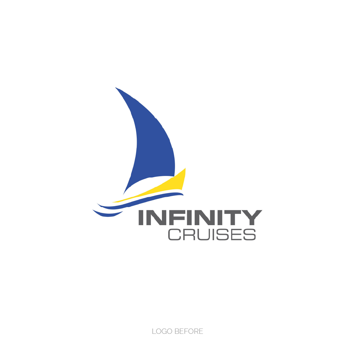
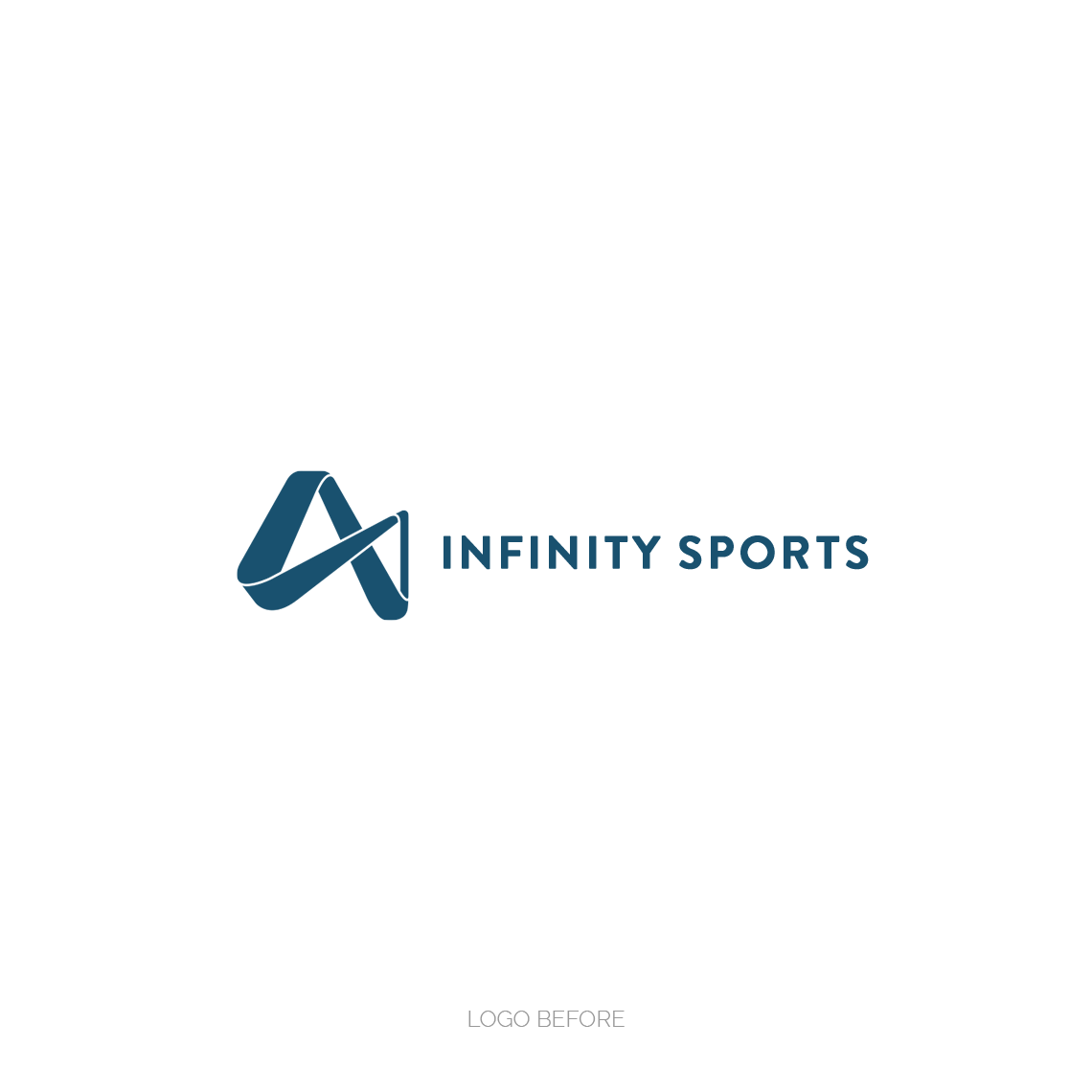
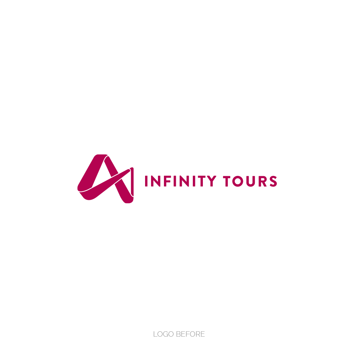
The first decision was whether to stay true to the existing designs or introduce a new style. The client gave me full creative control. I made the decision to develop the existing color palette and completely redesign all other aspects of the brand identity.
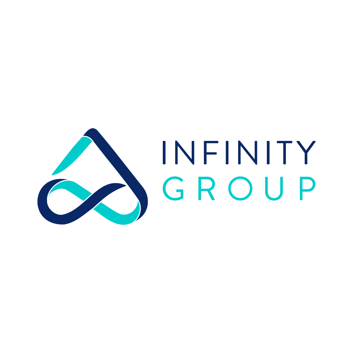
Logo Mark
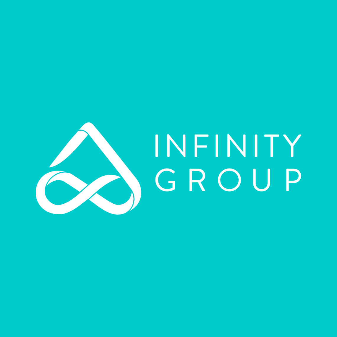
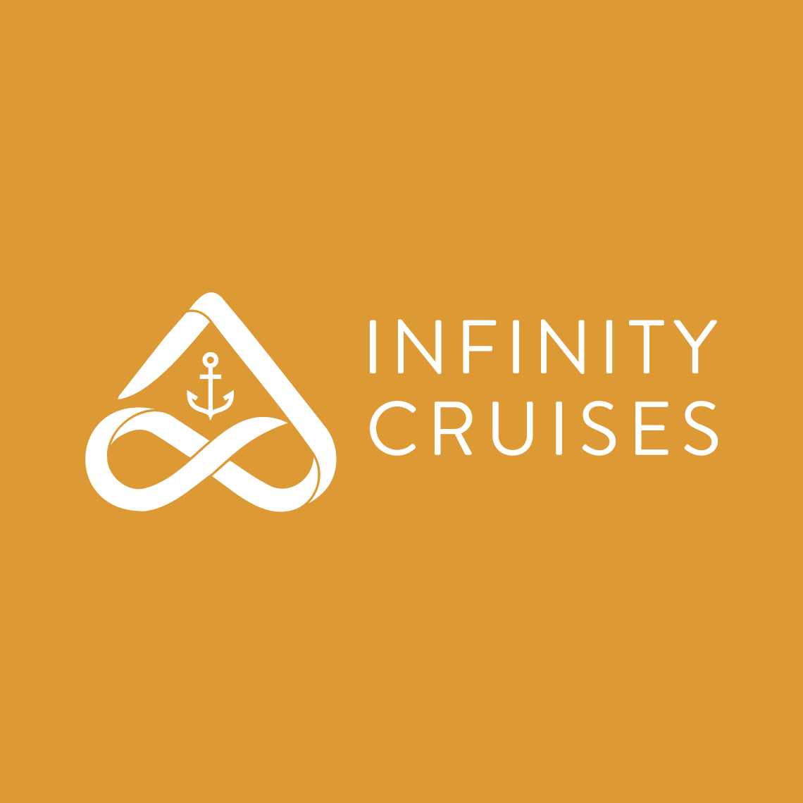
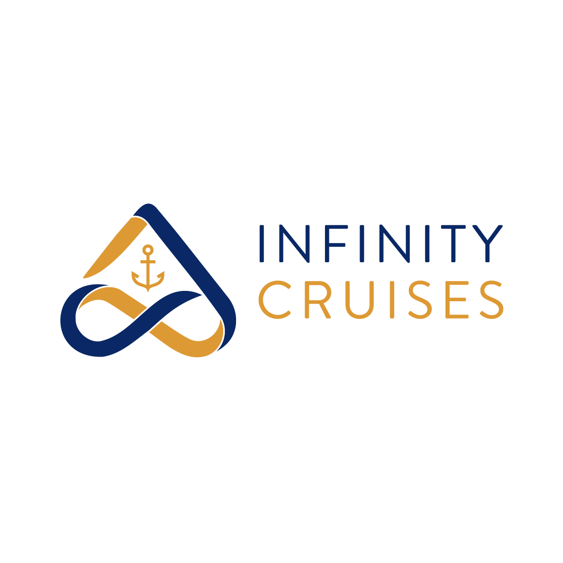
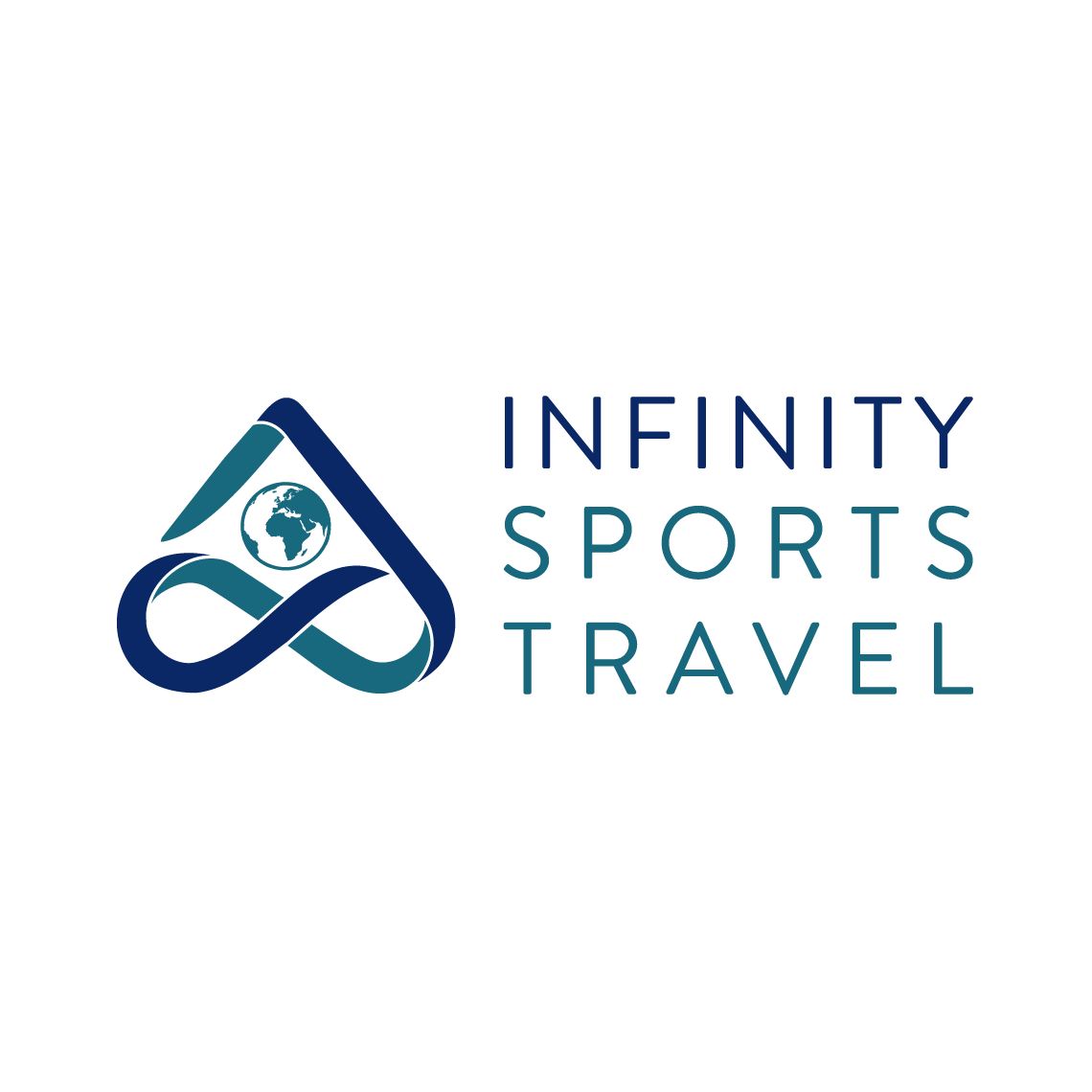
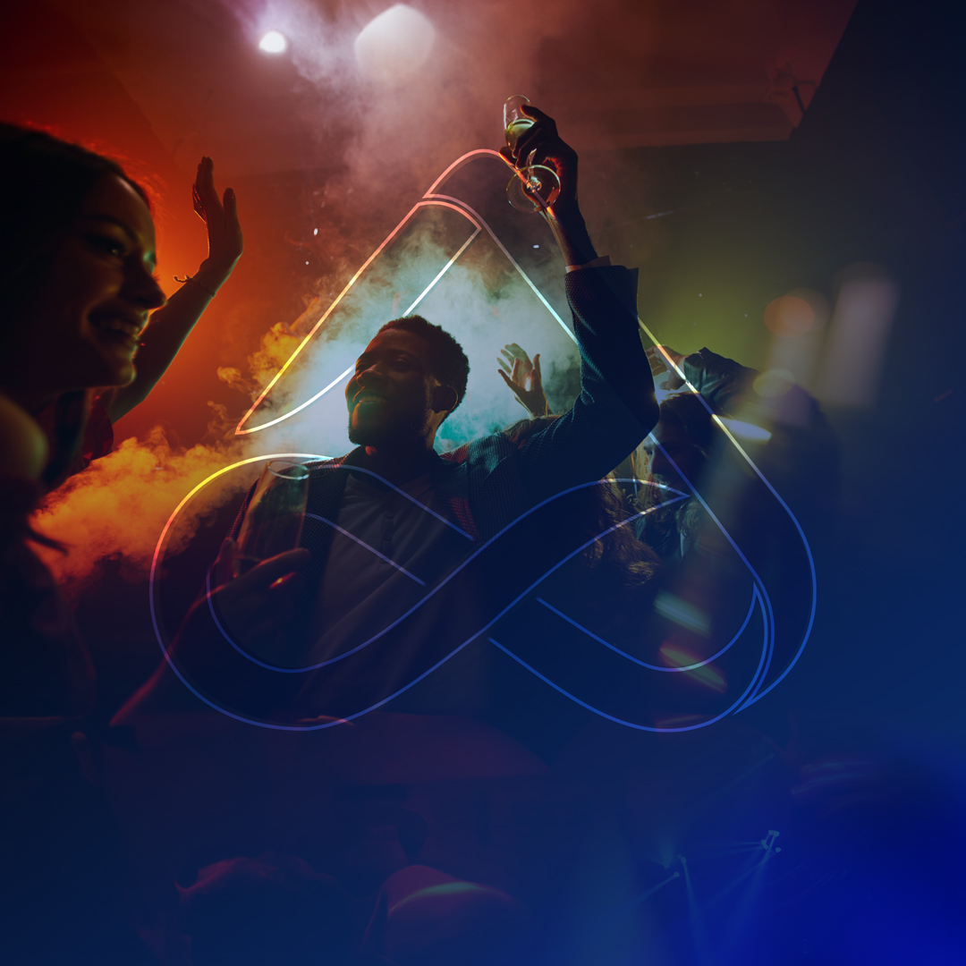
The challenge was to combine the universal infinity symbol with a sub-brand symbol and the company name harmoniously. Rather than haphazardly combining multiple icons, a distinct logo mark was created. It prominently showcased the company's identity while subtly hinting at each sub-brand through icons within the logo mark. This approach allowed for a cohesive system of sub-brands and co-branding opportunities, quickly identifying both the Group (Infinity Group) and the product (Sub-brand).
Core Value "Drive"
- Infinity Group
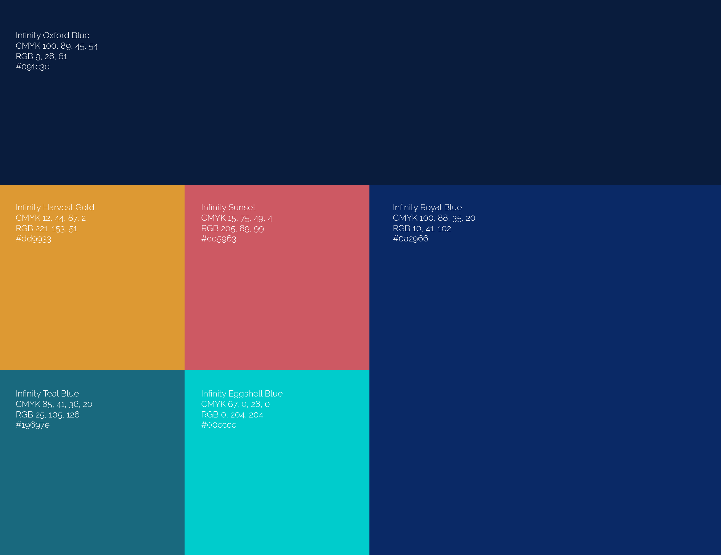
Colour Palette
The colour palette evolved from the Group's primary Infinity Royal Blue. I selected colours that complemented Infinity Royal Blue and paid homage to the previous brands: Infinity Eggshell Blue for Infinity Group, Infinity Harvest Gold for Infinity Cruises, Infinity Teal Blue for Infinity Sports Travel, and Infinity Sunset for Infinity Tours.
Symbolism
Infinity Symbol: Represents limitless potential.
Swoop Element: Signifies going above and beyond for customers.
Overall Shape: Resembles a 'house,' representing the Group, with individual sub-brands within it.
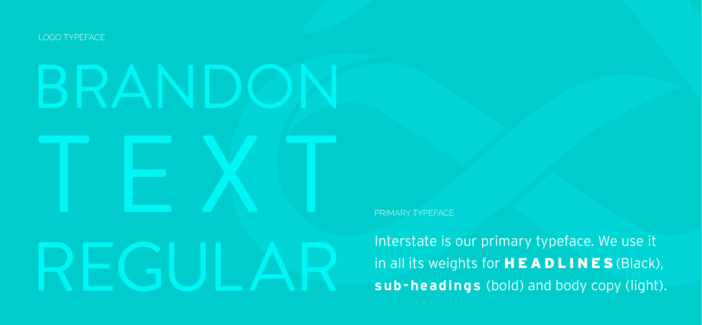
Typography
I chose Brandon Text Regular for the logo typeface for its modern, easily readable and minimalist style to harmonise with the intricate logo mark. The Interstate font family was selected as the primary typeface. One of Interstate's standout features is its high legibility. The even stroke widths and balanced letterforms make it easy to read in both print and digital media.


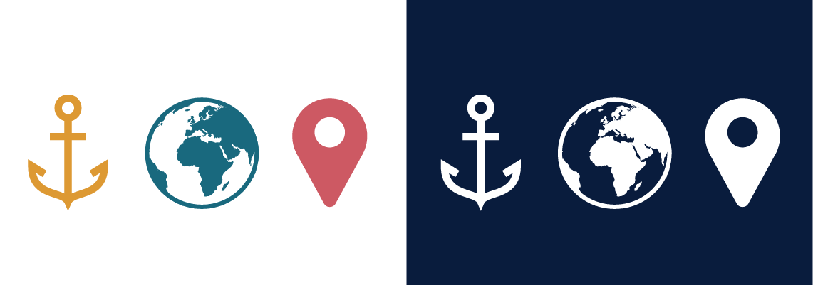
Icons
Clean, simple, and intuitive icons were designed with lines and smooth edges to illustrate Infinity Group's services and make user interfaces exciting.
Brand Patterns
Geometry from the logo mark was used to create brand patterns for diverse applications. When used creatively, the Infinity mark interacts with images in unique and engaging ways.
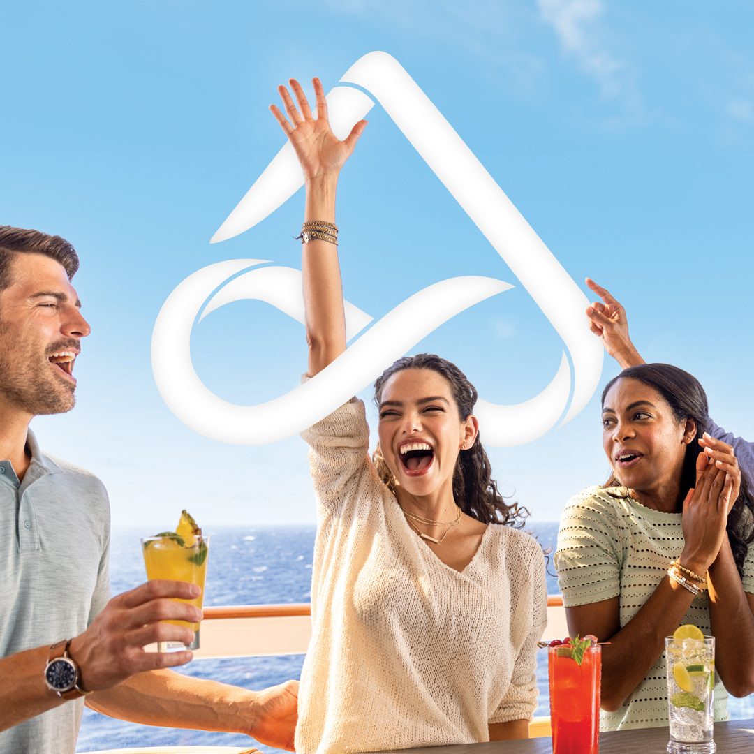
Imagery
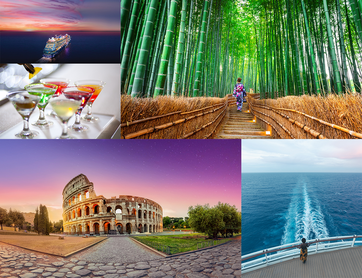
Instead of clichéd travel images, a range of images were carefully selected to convey a true sense of place and depict beautiful epic destinations.
Results
The rebranding of Infinity Group and its sub-brands successfully achieved the following:
- Consistency: A unified brand identity that maintains consistency across all brands.
- Symbol Integration: Seamless incorporation of the infinity symbol with sub-brand symbols and the company name.
- Core Values: Emphasis on the core value of "Drive" in the design.
- Adaptability: The brand identity can evolve as the company grows and diversifies.
- The new branding accurately reflects the company's values and vision, making Infinity Group and its sub-brands proud of their brand identity once more. It positions them as a dynamic and forward-thinking player in the travel industry, ready to meet the needs of a changing world.

More Projects
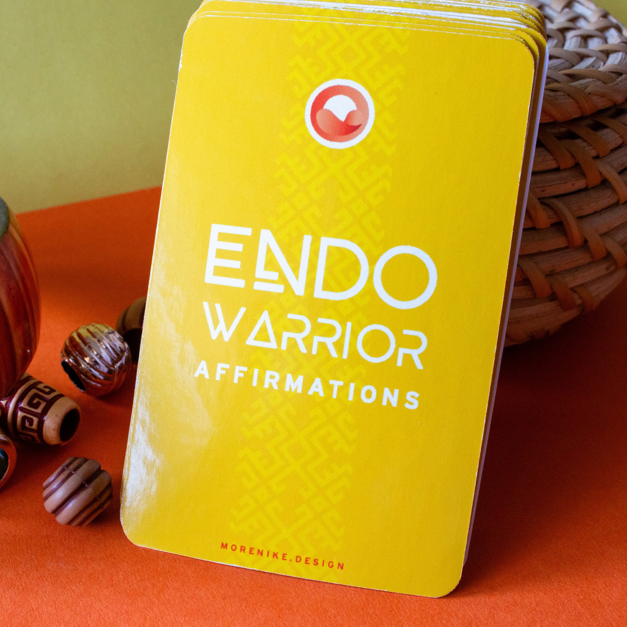
Endometriosis Awareness CampaignMotion Graphics
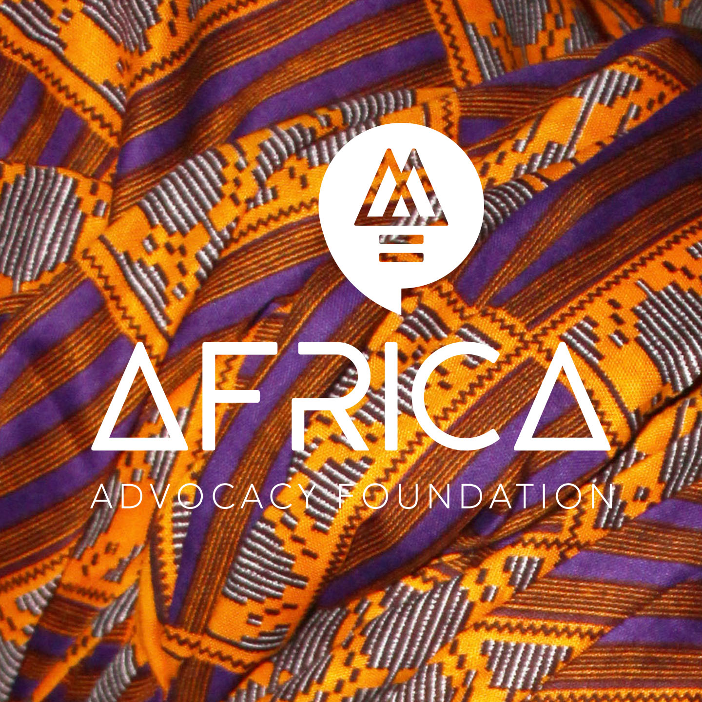
Africa Advocacy FoundationBranding

Wander LocksBranding
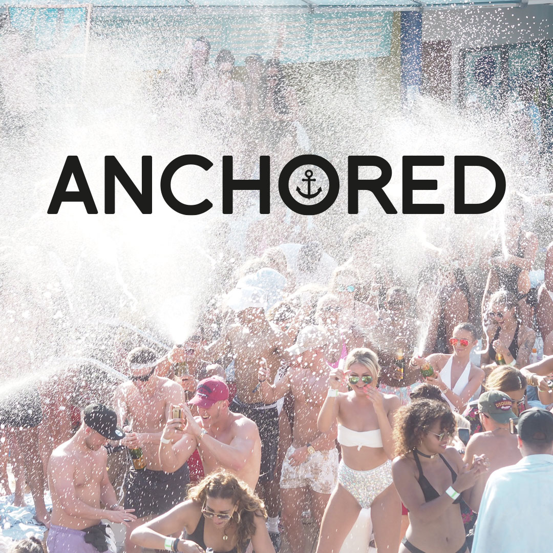
AnchoredBranding
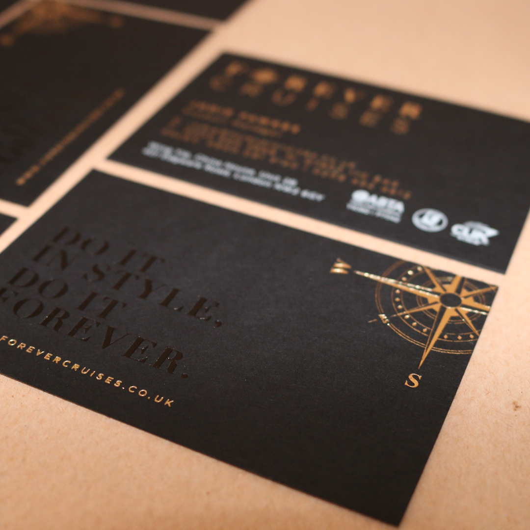
Forever CruisesPrint
Logo GalleryLogos

Wu-Tang Scotch BonnetIllustration